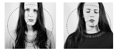
These are our first ideas for our inside cover where the CD will be, we wanted to choose photographs that fit similarly to the left inside cover and the front one. For our first idea it appears too central and would look better if it was more off centre to the left or to the right. to give it a quirkier appearance. I like the photograph in our second experiment as we our artist has her eyes shut, which contrasts to the outer cover which has her eyes open. We think this is a clever technique as eyes open on the outside and shut on the inside, it also links to our music video narrative, to how she is percieving herself to the audience, her outer apearance she is moving on with her life, better off without her boyfriend, more independant and confident, and then on the inside her eyes are shut to connote that she does still care about him but there relationship wasn't what it should have been. It has quite deep connotations. Her eyes shut also gives a peaceful, feminine quality. However, we still aren't sure about the positioning of the cover, with the fact that the image is cropped half off her shoulder which makes it unpleasing to the audience in regards to the 'Z' rule, because it makes the frame look un-coventional.

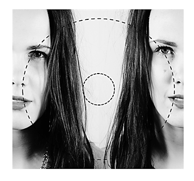
For this cover, we used two images zoomed into the models facial expression. On the left our model has a serious expression with a slight sad face which connotes the loss of their relationship and on the right the model's face appears stronger and more powerful to connote her independance and confidence without their relationship, showing her moving on. The monotone fits with the rest of our CD cover, and the two faces on each side look's quirky and unique.
AUDIENCE FEEDBACK:
Positive comments:
The monotone image gives a very deep contrast making it asthetically pleasing.
You can see the difference in the faces
You can see the assymetrical features such as the eyes, nose and jaw line.
Negative comments:
It's quite bold for an inside cover
You don't want it to overpower the other covers
You could have the image on the CD rather than the background
No comments:
Post a Comment