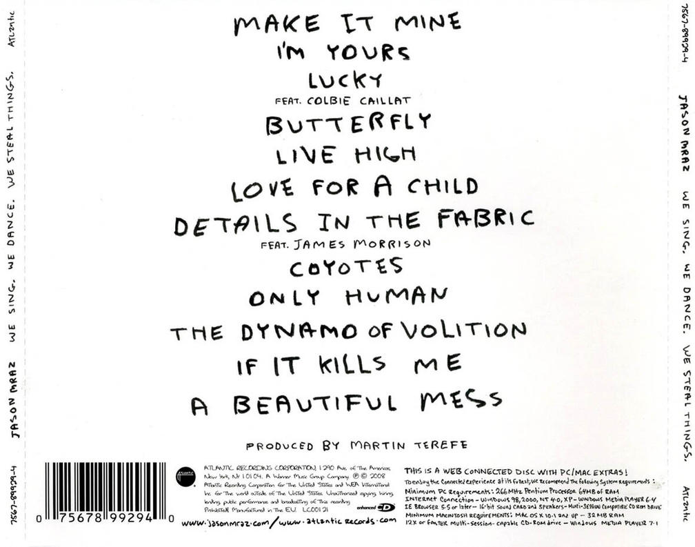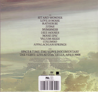

What we like about these CD covers was the way they get to the point, showing you what you want to know about the CD without distractions and pictures that hide the text. We liked the centralisation of the font and the typeface they both have. They are simple yet effective and as our CD front cover is black and white with a plain yet powerful effect we want to continue this and show continuity with the back, which we obviously couldn't have bright colours on.
We used Adobe Photoshop to create a gradient background on which we overlayed the names of the songs on our artists album, a barcode (generic of all CD covers), our record label 'LH STUDIOS', the artist recognisable name logo 'AA', a link to youtube and twitter to find out about our artist and a phone scanable barcode. We decided to include the last two ideas, as our target audience is young teens, mainly ranging from 13-18 and interactive media platforms such as, mobile phones, twitter, youtube, facebook etc, are the main hub teenagers use everyday, so by including this onto our back cover, it interacts with the audience, showing them we cater to their specific age and encouraging them to interact with our product and selling our artist. This is our first rough draft of the back cover, which we plan to get some feedback on to see if we can make improvements.

No comments:
Post a Comment