Monday, 2 December 2013

Ancillary Task 1 and 2

We have listened to our Audience Feedback from Ancillary Task 2, and decided to enhance some of our text so it is more prominent and dark. We also added (14) to make it clear what year it is in, and we have changed the 'plus guests' font to the sam colour as our border and embossed it on photoshop to make it stand out and more readable. To follow conventions of advertisements we have also added the facebook, twitter, youtube and phone barcode logo's to interact with our audience so they can interact via multi media platforms with our product making it available to wider range of audiences.
 
 
After we asked our Audience what they thought a good name for our album would be, we looked into some of the ideas and chose 'Momentum' as the name, which we have now added underneath the 'AA' to make a clear link between the two ancillary tasks which shows continuity.


(Inside left cover)
 

Ancillary Task 1

We have nearly finshed our Front Cover for our CD Digipack, we have chosen the name for our album now, so need to add that to the cover and spine and back cover. We are still in production for the inside cover on the right and the back cover. Which we need to upload onto our blog as soon as we can.

Feedback for Ancillary Task 2

Me and my partner Laura, asked for some feedback from our target audience on our 3rd draft for Ancillary task 2. We know it needs some tweaking and adjustments to make it look more proffesional and we plan to work on this, but we wanted to get a certain idea on what exactly our audience thinks of our Advertisement.

The positive feedback we recieved was: It is really effective
                                                                 Bold, very dramatic
                                                                 The two faces look professinal
                                                                 Very Eye-catching and proffesional effects
                                                                
The comments made for improvements were: Couldn't see some of the writing
                                                                          Some of the font could be darker
                                                                          Need a year next to September
                                                                          The writing needs to be enhanced
                                                                         

Tuesday, 26 November 2013

Ancillary Task 2, Second Ideas


We have taken on board, the feedback we recieved about our first ideas, and we have completely changed the layout, pictures, text, fonts, entirely. We have chosen to use the same picture as our CD cover to show a clear link between the two products and make it recognisable to our audience. We used photoshop to create our advertisement, by adding layers and text centrally descending. We also decided to get two signatures of other famous artists whom are similar to our artist in genre, and used the crop and magic wand tool, to clear their orginal backgrounds and then overlay them onto our advertisement. We feel this adds a professional look to our advertisement. We are planning to add more changes to it and get audience feedback on this so far.


Ancillary Task 2, 3rd Ideas

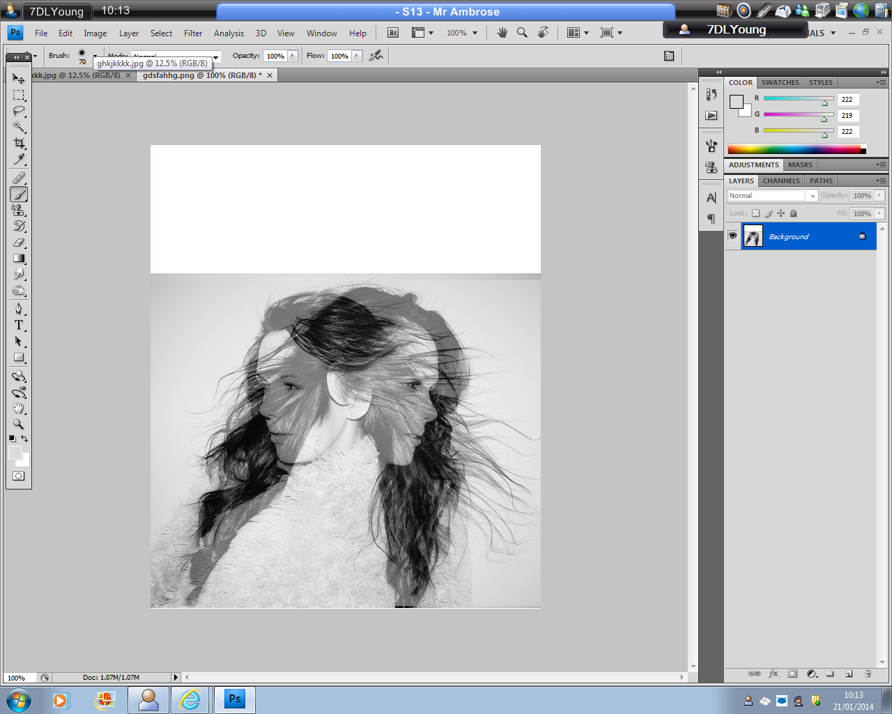
So after the feedback on our first ideas,we decided to completely scratch the whole document and start over. We chose a photo that we previously hadn't decided to pick as an option, but after we used some editing tools on photo-shop, duplicated it and used the layering tool, to overlay them, we decided that this photograph was a good decision. We have now started to add text, dates, borders and bevelling techniques to enhance the font to improve the task. However, we are going to get our audience to feedback to us on what they think so far, incase we will have to start again.


Audience Feedback on Ancillary Task 2 Ideas

We have shown our ideas to a group of girls in our target audience and asked what they thought and the feedback we got was mainly negative. We anticipated this would be the case, as we didn't like it our selves. What we were trying to do was make our magazine advertisement colourful rather than, black and white similarly to our CD Cover, however from the comments we recieved we have changed our mind.

Negative Comments: Her name overlaps her head and doesn't look good
                                   The colours don't work you can't read the font clearly
                                   The dress is unflattering
                                   She looks really pale
                                   There's not enough text
                                   The page doesn't look proportions

Monday, 25 November 2013

Audience Feedback

In my previous post, I had made some questions I was going to ask our target audience and reflect on the results we recieve. Me and my partner showed a group of 25, 15 year old girls

We had mixed feedback on which CD cover they liked the most, they seemed to like them both but the overall verdict by one or two opinions was the 1st cover.

What they thought was sellable about the albums were:

positive comments: It's plain yet effective
                                It's different and has a strong impact on the audience
                                The mirror effect is powerful
                                It's appealing to the eye
                                The mirroring effect and the overlaping looks professional
                                It's emotive and not over done with words and colour

The final question we asked was 'what do they think a catchy name is in 'one word?'

Comments: Momentum
                   Moving On
                   The Other Side
                   Over You
                   Love Died