Showing posts with label Ancillary Task 2. Show all posts

Monday, 2 December 2013

Ancillary Task 1 and 2

We have listened to our Audience Feedback from Ancillary Task 2, and decided to enhance some of our text so it is more prominent and dark. We also added (14) to make it clear what year it is in, and we have changed the 'plus guests' font to the sam colour as our border and embossed it on photoshop to make it stand out and more readable. To follow conventions of advertisements we have also added the facebook, twitter, youtube and phone barcode logo's to interact with our audience so they can interact via multi media platforms with our product making it available to wider range of audiences.
 
 
After we asked our Audience what they thought a good name for our album would be, we looked into some of the ideas and chose 'Momentum' as the name, which we have now added underneath the 'AA' to make a clear link between the two ancillary tasks which shows continuity.


(Inside left cover)
 

Feedback for Ancillary Task 2

Me and my partner Laura, asked for some feedback from our target audience on our 3rd draft for Ancillary task 2. We know it needs some tweaking and adjustments to make it look more proffesional and we plan to work on this, but we wanted to get a certain idea on what exactly our audience thinks of our Advertisement.

The positive feedback we recieved was: It is really effective
                                                                 Bold, very dramatic
                                                                 The two faces look professinal
                                                                 Very Eye-catching and proffesional effects
                                                                
The comments made for improvements were: Couldn't see some of the writing
                                                                          Some of the font could be darker
                                                                          Need a year next to September
                                                                          The writing needs to be enhanced
                                                                         

Tuesday, 26 November 2013

Ancillary Task 2, 3rd Ideas

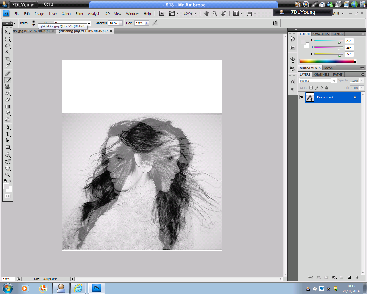
So after the feedback on our first ideas,we decided to completely scratch the whole document and start over. We chose a photo that we previously hadn't decided to pick as an option, but after we used some editing tools on photo-shop, duplicated it and used the layering tool, to overlay them, we decided that this photograph was a good decision. We have now started to add text, dates, borders and bevelling techniques to enhance the font to improve the task. However, we are going to get our audience to feedback to us on what they think so far, incase we will have to start again.


Audience Feedback on Ancillary Task 2 Ideas

We have shown our ideas to a group of girls in our target audience and asked what they thought and the feedback we got was mainly negative. We anticipated this would be the case, as we didn't like it our selves. What we were trying to do was make our magazine advertisement colourful rather than, black and white similarly to our CD Cover, however from the comments we recieved we have changed our mind.

Negative Comments: Her name overlaps her head and doesn't look good
                                   The colours don't work you can't read the font clearly
                                   The dress is unflattering
                                   She looks really pale
                                   There's not enough text
                                   The page doesn't look proportions

Wednesday, 20 November 2013

Ancillary Task 2- 1st Draft

 
These are just drafts/mock ups of some ideas for our magazine advertisent, we wanted to include our artists name at the top, in the same font asour CD cover to show a link to the audience, we also used the overlaying tools for our text so it blends with the colours of the picture. These are just some initial ideas but I'm not sure whether I like this so far as it is so different to our current draft of our CD Cover.


Tuesday, 12 November 2013

Photo-shoot for CD cover and Magazine Advertisement

Yesterday, me and my partner Laura, used a white backdrop and studio lighting to create our photoshoot for our Ancillary Tasks. We got our model composed centrally within the frame, or slightly to one side, which in turn leaves us space around her for our manipulations. We styled our model with loose, natural, wavey hair to connote an effortless appearance, red lipstick which connotes femininity, and also an alluring aura to attract a male audience. We chose two, outfits one a pinky/red dress with a jewelled necklace and the other a burgandy/red jumper with a jewelled collar. We wanted to stick to a similar colour theme throughout so both our Ancillary tasks link and show a connection between our products to our audience.


For these two images, we composed our model into an uposed posture with a natural open mouth pose. We want to convey a simple, natural appearance to our audience which we think suits best to our country/pop genre. We have chosen bright coloured lipstick and clothing which can be linked to the over accentuated associations with pop, but wavey hair amd simplistic poses which give a calming aesthetic quality to the images. This can be linked to the laid back associations with country music. 


We also used the monotone effect for some of our photographs to empahsise the natural raw beauty of the model. However, I don't like the photo above because I feel it is too blurry and the lighting wasn't bright enough to be edited fully. I do like the model's composition within the frame and the laughter because it shows her as a happy role model.

 
I really like both of these photographs both in black and white and colour because our model has a fixed gaze directly to the audience, to engage them with her product.


The two photographs are two of my favourites from the shoot, as my model beholds an alluring facial expression attracting her audience. I like the central position in the frame as it is the main focal point and allows space to manipulate them with text for trial cd covers. I love the sharp detail throughout the picture (below) and the strong eye contact the model has with us. I think this is one of our most successful photos from the shoot with the most professional appearance.


I like the bright colours from her dress and necklace which compliment with her dark hair. I chose to leave this photograph in colour because I feel it has strong tonal contrasts and the models facial expression is really powerful adressing the audience. The lighting is really bright against her face and the backdrop which creates an aesthetic quality to the image.


I think this photograph could work quite well as the CD cover because the colours are strong and also she is smiling which completely changes the feeling of the viewers point of view. It interacts positively with the audience giving off a relaxed appearance which with the colours fits with our country/pop theme. 


For these two pictures we changed our models clothing to a burgandy/red jumper with a jewelled collar. We chose to stick to red because when choosing one for our cd cover and one for our magazine advertisement it will show a connection between the two products. I don't think our models facial expression works very well as she seems a bit confused, but I really love the photo below because I think with her eyes closed it is a really different composition and it seems like she is making a wish which could reflect the audience wanting to have the album.


Tuesday, 15 October 2013

Ancillary Task 2, mock-up


This is our blank mock-up of our magazine advertisement for our second ancillary task. After previous research into magazine advertisements we want to include everything that they include to sell/promote our artist. We are going to include, critics reviews, star ratings, awards, record labels, quotes from reviews and a main image of the artist to entice the audience, either a new image or one that links to ancillary task 1, to show a connection between the artists products.


Wednesday, 17 July 2013

Magazine Advertisement Research (Ancillary task 2)

Magazine Advertisements appear throughout many types of publications. Advertising is one of the main factors that keep magazines maintained; nearly every magazine relys upon revenue from advertisers to stay in business, advertising can make or break a publication. The genre of the magazine usually depicts the genre of the magazine adverts inside. For example in Kerrang a rock magazine, you wouldnt expect to see advertisements of Katy Perry or Lady Gaga. The purpose of a magazine advertisement is to sell/promote the artist. Therefore everything about the ad aims to represent the artists music style, persona or genre of video.