After putting together the sections of our CD Digipack, including the spine, front cover, back cover, inside cover and CD, me and my partner decided to get some final feedback on our product.
The most re-occurring results we received were:
1) All covers link together with the same effects which make it look professional
2) The phone bar code on the back cover interacts with audience effectively
3) The eye contact from your artist is powerful to communicate with us as the audience because it helps sell your artist.
4) I love the white speckled effect across each cover which makes them look unique
5) The copyright statement on the back makes the CD look professional
After looking at this feedback, we decided that we were really happy with the comments about our product and we didn't feel we needed to change anything more to the Digipack.
Showing posts with label Ancillary Task 1. Show all posts
Showing posts with label Ancillary Task 1. Show all posts
Sunday, 19 January 2014

Monday, 16 December 2013
Ancillary Task 1- CD Digipack

Friday, 13 December 2013
Ancillary Task 1- Idea Improvements
After looking at the main ideas from our Audience Feedback we have decided we need to re-design our CD in the inside cover. We are going to use on of the same images from before in black and white as it shows continuity for the whole CD Digipack and we are going to put the image onto the CD rather than as a background because we have realised that is what all CD's do.


This is our first idea, we have used the same photo as the third idea on our previous post as it was a favourite from our audience but instead of half of her face we have used her whole face. By doing this our artist has direct eye contact to the audience making it a powerful and effective selling point.

However we have edited this idea further by uploading it onto Picmonkey.com and adding the same filter which we have used on our front and back cover. Which gives a speckled effect and shows constant continuity between every aspect of the Digipack.
Ancillary Task 1- Inside Cover Feedback
We got feedback from our first ideas of our inside over where the CD is going, and the most re-occuring audience's ideas for us were:
POSITIVE
"we like the photograph on your third idea where she is mirrored but we would prefer to see her whole face rather than half of it"
"I like that your going to have it monotone, as it will compliment the rest of your CD Digipack"
NEGATIVE
"I think you need to put the photograph onto the CD rather than as the background, it doesn't look good like that"
"I think you need to use the third photograph with her full face, but onto the CD"
Tuesday, 10 December 2013
Ancillary Task 1- Inside
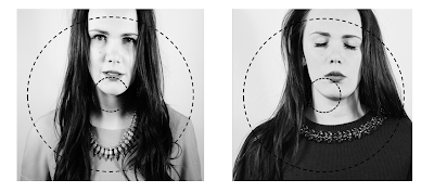
These are our first ideas for our inside cover where the CD will be, we wanted to choose photographs that fit similarly to the left inside cover and the front one. For our first idea it appears too central and would look better if it was more off centre to the left or to the right. to give it a quirkier appearance. I like the photograph in our second experiment as we our artist has her eyes shut, which contrasts to the outer cover which has her eyes open. We think this is a clever technique as eyes open on the outside and shut on the inside, it also links to our music video narrative, to how she is percieving herself to the audience, her outer apearance she is moving on with her life, better off without her boyfriend, more independant and confident, and then on the inside her eyes are shut to connote that she does still care about him but there relationship wasn't what it should have been. It has quite deep connotations. Her eyes shut also gives a peaceful, feminine quality. However, we still aren't sure about the positioning of the cover, with the fact that the image is cropped half off her shoulder which makes it unpleasing to the audience in regards to the 'Z' rule, because it makes the frame look un-coventional.
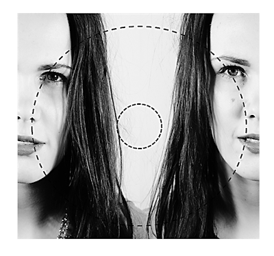
For this cover, we used two images zoomed into the models facial expression. On the left our model has a serious expression with a slight sad face which connotes the loss of their relationship and on the right the model's face appears stronger and more powerful to connote her independance and confidence without their relationship, showing her moving on. The monotone fits with the rest of our CD cover, and the two faces on each side look's quirky and unique.
AUDIENCE FEEDBACK:
Positive comments:
The monotone image gives a very deep contrast making it asthetically pleasing.
You can see the difference in the faces
You can see the assymetrical features such as the eyes, nose and jaw line.
Negative comments:
It's quite bold for an inside cover
You don't want it to overpower the other covers
You could have the image on the CD rather than the background
Ancillary Task 1- Spine for CD Digipack
We had a look at spines for CD covers and we have noticed that a lot seem to be completely plain, with either one of two colours on, and just the name of the artist, the album and the record company/prdoucer logo/name with a sort code. What we think best for our CD spine, as our cover is black and white, is too keep it simple but still match the theme of our cover.


 |
| Add caption |
Ancillary Task 1- changes
We have made more changes rto our Back Cover for our CD Digipack, we have looked at other covers more closely and noticed a lot of them have 'copyright/reserve' statements on them and so we decided, to make our cover look more professional, we would add that to the bottom of ours.


We have added the copyright statement with a 'c' symbol and distributed by details with a sort code, by doing this we have given our CD a more professional appearance, we have also made the font for the song names smaller as we felt they looked to overpowering before distracting from the other details on the cover.
Monday, 9 December 2013
Ancillary Task 1 - CD Digipack, Back Cover Design
We have looked up some designs for back covers on google and have found that they tend to be quite plain, with no images on them, we have used these for inspiration for our designs:

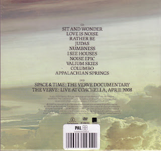
What we like about these CD covers was the way they get to the point, showing you what you want to know about the CD without distractions and pictures that hide the text. We liked the centralisation of the font and the typeface they both have. They are simple yet effective and as our CD front cover is black and white with a plain yet powerful effect we want to continue this and show continuity with the back, which we obviously couldn't have bright colours on.

What we like about these CD covers was the way they get to the point, showing you what you want to know about the CD without distractions and pictures that hide the text. We liked the centralisation of the font and the typeface they both have. They are simple yet effective and as our CD front cover is black and white with a plain yet powerful effect we want to continue this and show continuity with the back, which we obviously couldn't have bright colours on.

We used Adobe Photoshop to create a gradient background on which we overlayed the names of the songs on our artists album, a barcode (generic of all CD covers), our record label 'LH STUDIOS', the artist recognisable name logo 'AA', a link to youtube and twitter to find out about our artist and a phone scanable barcode. We decided to include the last two ideas, as our target audience is young teens, mainly ranging from 13-18 and interactive media platforms such as, mobile phones, twitter, youtube, facebook etc, are the main hub teenagers use everyday, so by including this onto our back cover, it interacts with the audience, showing them we cater to their specific age and encouraging them to interact with our product and selling our artist. This is our first rough draft of the back cover, which we plan to get some feedback on to see if we can make improvements.
Monday, 2 December 2013
Ancillary Task 1 and 2
We have listened to our Audience Feedback from Ancillary Task 2, and decided to enhance some of our text so it is more prominent and dark. We also added (14) to make it clear what year it is in, and we have changed the 'plus guests' font to the sam colour as our border and embossed it on photoshop to make it stand out and more readable. To follow conventions of advertisements we have also added the facebook, twitter, youtube and phone barcode logo's to interact with our audience so they can interact via multi media platforms with our product making it available to wider range of audiences.

After we asked our Audience what they thought a good name for our album would be, we looked into some of the ideas and chose 'Momentum' as the name, which we have now added underneath the 'AA' to make a clear link between the two ancillary tasks which shows continuity.

(Inside left cover)

Ancillary Task 1
We have nearly finshed our Front Cover for our CD Digipack, we have chosen the name for our album now, so need to add that to the cover and spine and back cover. We are still in production for the inside cover on the right and the back cover. Which we need to upload onto our blog as soon as we can.
Friday, 22 November 2013
Choosing our Album Name
We needed to choose an album name, that will match our Music Video and which is catchy in one word. We asked in our previous audience research for some ideas and the results we got were: momentum, Moving On, The Other Side, Over You and Love Died. However the only one we liked was Momentum, as we felt that it really reflects the theme of our video. Momentum means moving quickly, and this emulates the narrative of our video. (Which we are re-editing now) Our artist starts the video upset about her relationship and looking back on it, and as it progresses she realises quickly how bad their relationship really was and how she is going to move on now. So we feel Momentum, fits our song to our music video and also links to our choice of how we designed our CD Cover.
Friday, 15 November 2013
New CD Cover Ideas 2
We have researched some more CD Covers and we really like when album covers are in black and white, with the idea that 'the more simplistic the more effective' it is. We really like how Miley Cyrus' album cover just has a capital 'M' overlaying the image but also with a transparent effect so it doesn't blank out the image. We are going to try this with out photos and also try flipping the photo so it doubles up the picture. For example: (see below)


We think this is really effective as our narrative begins with our model being sad about her relationship and the way it is but as she goes through the song she sees how negative it actually is and she begins to become happy as she know's she is better without him. So this photo emulates this perfectly, the first picture facing the left shows her looking back at her relationship and then the second picture facing the right is her looking forward towards a better life, and we can see a slight smile on the models face. The effect is really powerful towards the audience and the faded effect shows a passing in time.
Using Photoshop me and my partner have started designing new cover ideas using the research above. Therefore we have started to use the layering tools to overlay text onto our picture. We have also used the blending tool to merge the two together and picmonkey.com to add effects over the top such as sun rays and the 'bokeh' effect to make our artist look like an icon/ star. We think these ideas are our strongest so far, we have also flipped the 'A' backwards and placed two next to eachother to create symmetry and patterns in the frame.


I have just created a possible inside left hand cover for our CD, I have chosen one of our favourite images from our photoshoot, and manipulated it by adding the lyrics to our music video onto it. I think the black and white font blends well with the image and the photograph is so powerful with our models eye contact straight at the audience and the atmosphere it creates is effective.

Change of Artist Name
We have decided to change our artists name from Lola-Marie to Ava Marie, partly because we think Lola-Marie is too long when we want to add text and change the effects and also because with the new photos we've taken we think an 'A' will work really well with the layout of the image.
Thursday, 14 November 2013
Ancillary Task 1- Audience Feedback
Expect to see:
Picture of Artist (close-up or mid-shot)
Name of Artist
Eye-catching colours
Special Effects
Special Effects
Colour Scheme: Black and White
or
or
pale pastel colours to compliment outdoor scenery in video clips
How should the Artists name be on the cover:
Central at the top
Central at the bottom
Central at the bottom
Diagonal across the top corner
What do they want from it:
Eye-catching that makes your Artist stand out
Simplicity
Not too busy, so there is too many distractions from the product itself
Simplicity
Not too busy, so there is too many distractions from the product itself
We are going to ask our target audience:
What they expect from to see on our Cover?
What colour scheme do they want after seeing our photos?
How should we have our Artists name on the cover?
What do they want from it?
New CD Cover Ideas
We have chosen our favourite image from our photo-shoot in the studio, and cropped it in a way that allows room for manipulation, we also think by cropping off her shoulder we get an effective composition which is pleasing to the eye. We have decided to change the quality to black and white to emphasise our models natural beauty and make her appealing to the audience. We have chosen this photo, because the lighting is strong and creates powerful tonal contrasts with her skin and the monotone effect. We have chosen this photo because as her eyes are closed as it links to the lyrics and it connotes the momentary pause before her emotional feelings saying 'just before goodbye'. However we don't think the photograph is powerful is enough to connect to her audience and the font we have chosen which has been flipped sideways, doesn't fit the Z effect and look right to the audience's eyeline. Also it isn't big enough, the 'IT' is lost into her hair and the colour doesn't look right.

Tuesday, 12 November 2013
Photo-shoot for CD cover and Magazine Advertisement
Yesterday, me and my partner Laura, used a white backdrop and studio lighting to create our photoshoot for our Ancillary Tasks. We got our model composed centrally within the frame, or slightly to one side, which in turn leaves us space around her for our manipulations. We styled our model with loose, natural, wavey hair to connote an effortless appearance, red lipstick which connotes femininity, and also an alluring aura to attract a male audience. We chose two, outfits one a pinky/red dress with a jewelled necklace and the other a burgandy/red jumper with a jewelled collar. We wanted to stick to a similar colour theme throughout so both our Ancillary tasks link and show a connection between our products to our audience.

For these two images, we composed our model into an uposed posture with a natural open mouth pose. We want to convey a simple, natural appearance to our audience which we think suits best to our country/pop genre. We have chosen bright coloured lipstick and clothing which can be linked to the over accentuated associations with pop, but wavey hair amd simplistic poses which give a calming aesthetic quality to the images. This can be linked to the laid back associations with country music.


We also used the monotone effect for some of our photographs to empahsise the natural raw beauty of the model. However, I don't like the photo above because I feel it is too blurry and the lighting wasn't bright enough to be edited fully. I do like the model's composition within the frame and the laughter because it shows her as a happy role model.

I really like both of these photographs both in black and white and colour because our model has a fixed gaze directly to the audience, to engage them with her product.


The two photographs are two of my favourites from the shoot, as my model beholds an alluring facial expression attracting her audience. I like the central position in the frame as it is the main focal point and allows space to manipulate them with text for trial cd covers. I love the sharp detail throughout the picture (below) and the strong eye contact the model has with us. I think this is one of our most successful photos from the shoot with the most professional appearance.


I like the bright colours from her dress and necklace which compliment with her dark hair. I chose to leave this photograph in colour because I feel it has strong tonal contrasts and the models facial expression is really powerful adressing the audience. The lighting is really bright against her face and the backdrop which creates an aesthetic quality to the image.


I think this photograph could work quite well as the CD cover because the colours are strong and also she is smiling which completely changes the feeling of the viewers point of view. It interacts positively with the audience giving off a relaxed appearance which with the colours fits with our country/pop theme.

For these two pictures we changed our models clothing to a burgandy/red jumper with a jewelled collar. We chose to stick to red because when choosing one for our cd cover and one for our magazine advertisement it will show a connection between the two products. I don't think our models facial expression works very well as she seems a bit confused, but I really love the photo below because I think with her eyes closed it is a really different composition and it seems like she is making a wish which could reflect the audience wanting to have the album.


Thursday, 7 November 2013
CD cover production ideas

I have print-screened our process of creating our first ideas for our Front cover of our CD Digipack. We have used one of the pictures from our second stage of filming, and used photo-shop to enhance the image, adding a green filter and a subdued tint. We chose one of the fonts from dafont.com that we liked the most, and manipulated the text on photoshop by using the 'magic wand' tool to get rid of the background so the text was transparent over the picture, and changed the colour of the font to white. We are going to test a lot of the pictures we took from our filming but we also plan to take a photo-shoot in the studio against a white backdrop, to create a professional look. As we don't like the angle the photo was taken from as we feel it's unflattering to the model and we also don't like the large gap between the text.

This printscreen shows, I have started to test the layer style, by manipulating the contours, blending options and shadows, I feel this is going to start creating a proffesional appeal, by adding 3dimensional effects.

This is our second CD cover idea, we have chosen this picture as we feel it posesses an atmospheric quality with the sunlight on the water and trees in the background, and the bright glow from the models skin and hair. We have cropped this photo from its original size to fit the dimensions of the square cover. I have added another layer to insert the text, however for this one we have changed the font and kept the colour black, however we feel the black doesn't stand out against the trees and we will need to change it to a brighter colour to entice the audience.
Wednesday, 6 November 2013
Test Font for CD Digipack

Fonts Research for CD Digipack

We are researching CD Cover fonts, for different genres of music to get the right idea of fonts to use. We have looked at R&B fonts which tend to be large, often in capital letters, bulky, and with sharp 3d edges. We do not like this appeal and feel it isn't suitable for our country pop genre as we want a thin, delicate/quirky font.

Katy Perry is a pop music artist, and I have noticed the trend for Pop music covers is curly font, bright lettering/ colours that fit the artist's music. We like the bright colours and the thin font, however we want less of a curly font and more unique to a typical girly font. The covers tend to give a basic idea about what music to expect, but they mainly reflect the artist's personality. The most effective covers have a main image which fills the whole cover with a simplistic font overlaying the image.


Nina Nesbitt is a country/pop artist, and the style of her music covers with a patterned background and simplistic, thin font is the type of cover we want to make ours like. We want plain colours and catchy font but an effective image, to really sell our product and artist.
Tuesday, 5 November 2013

Subscribe to:
Posts (Atom)